Show and Tell: Disk Sensei by Oskar Groth

About Oskar

Oskar is an independent Mac developer who is committed to enhancing the Mac experience.
Since founding Cindori, he has designed, developed and released several popular apps such as Trim Enabler, Disk Sensei and VR Desktop.

About Disk Sensei

Disk Sensei helps you monitor and analyze your Mac’s drives, enhance your Mac’s performance and clean your system safely and efficiently.

Info

What Oskar particularly likes in Disk Sensei:
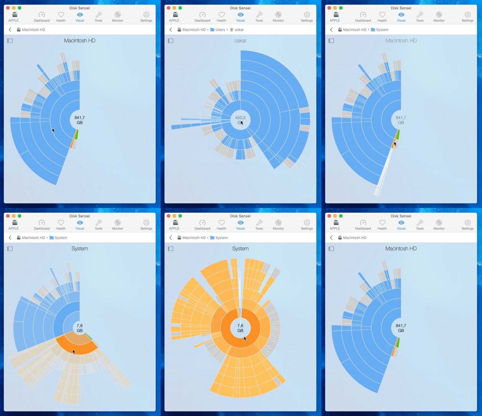
Liked by Oskar

“Disk Sensei is all about optimizing your Mac performance, so I knew I wanted a way to let users find and delete large old files.
After settling on the idea to build a sunburst chart to visualize the file system hierarchy, I struggled for a long time to build something that was responsive, performant and beautiful.
Eventually, I turned to an unconventional solution: I built a component using D3, a JavaScript visualization library, and integrated it in Disk Sensei using a web view.
The end result was a beautiful sunburst chart with slick animations, at the cost of only a few hundred lines of Obj-C.”

and particularly dislikes:
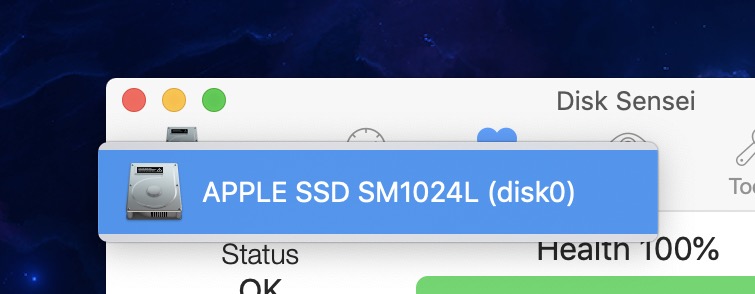
Disliked by Oskar 1

Disliked by Oskar 2

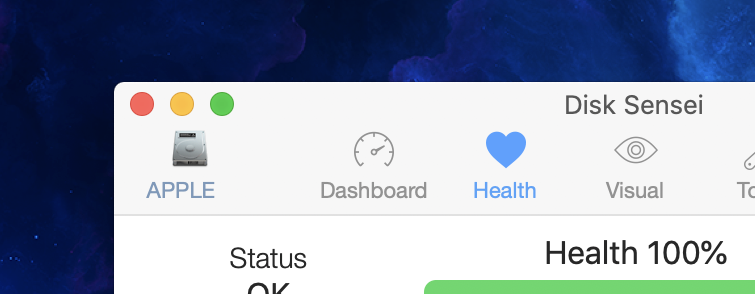
“Disk Sensei offers features that are related to both hardware and software. In some cases, this means that the user must select the storage drive for which he wants to display data or perform actions on.
For example, the Health feature, which displays diagnostic data and predicts the remaining lifetime of your hard drive or SSD.

To avoid having to select a storage drive over and over when switching between features in the app, I opted for a global option and put a drive selection button right in the menu bar of the application window.
This made it very easy to toggle between drives from any view in the app. But it also created several problems:
It broke the conventions of the menu by having the button look like it’s supposed to behave like a menu option.
It created even further confusion by being accessible while using features that wasn’t related to the currently selected drive. As if that wasn’t enough, the button was just too small to fit the full drive name, creating cryptic titles such as “APPLE”.
All in all, this was a poor solution.”

Thank you, Oskar, for sharing :)

About the “Show and Tell” Blog Series

Show and Tell presents developers’ and designers’ most and least favorite elements of UI/UX in an app they helped create or design.
If you’d like to share, submissions are open! Submit your app here!
Thank you :)


New Blog Series: Show and Tell

In this new series on this blog, I’d like to give developers and designers a place to show off  one UI / UX element they’re particularly proud of, and one they particularly dislike, in an app they worked on.

Submit now :)

If you’re a developer or designer and would love to share a UI/UX element in your app you particularly like, and one you particularly dislike, please mail me!

What I need from you

  • Your name, or, if you like, state that your submission should be anonymous. Your email and other contact info will not be published
  • Your website, twitter/facebook/instagram/github handle, or any other way you’d like to be credited (if it’s not an anonymous submission)
  • A short description of who you are and what you do
  • Your involvement with the app
  • The name of the app with a link (if you’re willing to share, but it’s not a must)
  • A screenshot, short video or gif of a UI/UX element in your app you particularly like, with 1-2 sentences of why you like it
  • A screenshot, short video or gif of a UI/UX element in your app you particularly dislike, with 1-2 sentences of why you don’t like it
  • Please only send apps you worked on yourself
  • Multiple submissions are fine

A post will look something like this:
D1uJjScWkAI5DTr.jpg-large
Submissions will be published on no particular schedule in no particular order on this blog.
You’ll be notified beforehand with a preview.
Submissions will (or will not) be published at my own discretion.

I’m looking forward to your submissions!

For updates, please follow this blog, or @showandtell_ui on twitter.

Follow-Up: Inactive Checkboxes Are Poor UX

[This is a follow-up to this blog post. It was inspired by the response I received through social media and different websites.]

In a previous version of Yoink, I had the following conundrum:

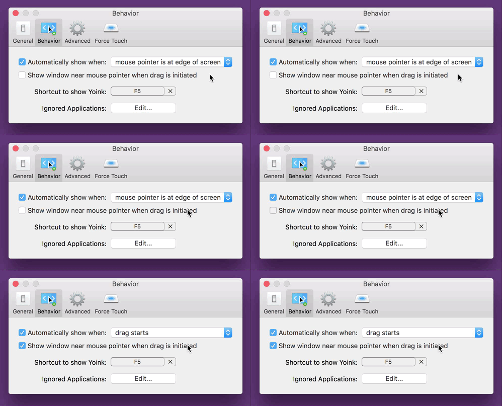
Yoink 3.2 Preferences Inactive Checkbox

The checkbox “Show window near mouse pointer when drag is initiated” is inactive and needs extra steps to be activated.
If I’m a new user of the app, at first, I have no idea how to activate that checkbox. At best, it’s something I need to set in this preference panel, at worst it’s a setting in a different one.
As a new user, my only option is to blindly change settings, waiting for one to activate the checkbox so I can select it.

There are different solutions to this problem, of varying degrees of effective- and usefulness:

  • A tooltip. If the checkbox is inactive and you hover over it, a tooltip appears, explaining what to do to activate the checkbox.
    It’s a quick and easy solution, however, it’s almost undiscoverable. I know of many users who don’t even know tooltips exist.
  • Hiding the checkbox instead of having it be inactive.
    That’s better, as it reduces clutter (as the checkbox would be inactive anyway). But it introduces another problem – nobody knows that the option even exists.

“For that UI, I think maybe an additional improvement would be to actually hide and show the checkbox completely instead of disabling it.
Also, indent the second checkbox so that it feels like it’s a sub-section of the first.
Another option might be to split things out into radio buttons instead of checkboxes and the popup menu.
That way you could expose the additional option tied to the appropriate radio choice, which you can’t exactly do with the menu item.”

Manton Reece, via Core Intuition’s slack channel

  • Speaking of radio buttons, Adrien Maston wrote me a very detailed mail with some ideas he had about resolving the issue:
    Adrien Maston Radio Button Yoink

Since there are only two options for « automatically show when », maybe the setting could be radios instead of a select.
Then each option would be formatted as a column and each column would contain specific settings (the « drag starts » column would contain the « Show window near mouse pointer when drag is initiated » checkbox. Then it would make sens that clicking the checkbox would also set to « drag starts ».

Adrien Maston, via eMail

What I ended up doing in Yoink v3.2.1, the release that followed this discussion, was this:

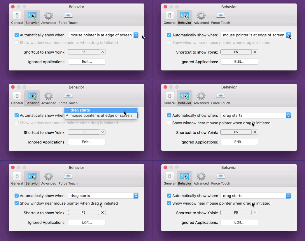
Yoink 3.2.1 Preferences Active Checkbox

Instead of having the checkbox inactive, it’s active at all times and can be clicked right away. The advantage of this is that for one, the user knows the option exists and two, the user can select the option right away without having to figure out how to activate it.
The downside, and this has been pointed out to me a couple of times, and I agree, is that clicking the checkbox changes two settings at once (the checkbox and the popup, as you can see in the GIF above). It changes a setting the user has made before. And that’s bad UX design on its own right there.
My thinking was, it’s in the same preference pane, so the user sees what’s happening right away. It still was the wrong decision (as has been pointed out to me in the comments on designernews.co).

For Yoink v3.2.5, I re-thought the whole thing and decided to make it three options in a popup.
This is the result:

Yoink's Behavior Preference Pane in v3.2.5

It solves a couple of things:

  • The inactive checkbox is a thing of the past
  • The options you have for when and where Yoink should appear are much clearer
  • You get a preview video for every option so you know right away how each setting affects Yoink
Additionally, I think it’s the nicest Yoink’s Behavior preference pane has ever looked, so that’s a plus ;)

Eternal Storms Software Logo

– – – Do you enjoy my blog and/or my software? – – –
Stay up-to-date on all things Eternal Storms Software and join my low-frequency newsletter (one mail a month at most).
Thank you :)